The Synesthesia of Colors: A Dual Exhibition by Zunglung Tsai and Yuvia Ye
Written by Heya Huang
“Color” is undoubtedly an objective visual phenomenon, yet more often than not, it opens up our other senses. We say “ghastly white,” “oppressive black,” and “vivid red,” adding descriptive words before and after the color terms that come from daily life. Why is white considered “ghastly”? Why does black feel “oppressive”? Why is red “vivid”? Qian Zhongshu said, “In daily experience, visual, auditory, gustatory, olfactory, and tactile senses often interconnect or communicate. The domains of the eyes, ears, tongue, nose, and body can be indistinguishable. Colors seem to have temperatures, sounds appear to have shapes, warmth and coldness seem to have weights, and smells appear to have textures.”
As a dual exhibition, the works of Zunglung Tsai and Tingan Yeh can ignite sparks of everyday life through “color” in the same space, directly reaching the viewer’s five senses. “Synesthesia” is actually a commonly used literary technique, as mentioned in the previous example. To further explain, Eileen Chang was a master of this technique. In “Love in a Fallen City,” she wrote: “She sat on the bed, the ‘hot darkness’ wrapped around her like a ‘grape-purple’ velvet blanket.” Here, “darkness” connects to the tactile sense of “hot,” and “grape-purple” is a visual imagination. In “When We Were Young,” she wrote: “The school bell rang, and ‘a small string of golden bell sounds’ hung in the clear sky.” Here, the visual “golden” connects to the auditory “bell sounds.” This illustrates “synesthesia,” and if one asks what concrete effect this writing technique achieves, I believe it is “empathy.” This effect is clearly an indispensable part of art appreciation, and one of the core topics of Western Romanticism revolves around “rationality” and “empathy.” The following will explain how these two artists use color to evoke empathy in viewers.
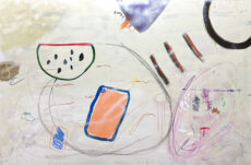
In Tingan Yeh’s works, the use of “color” is clearly viewed with curiosity by the audience. A single image often presents multiple colors, and the title of the work is usually an objective existence. I guess perhaps the various colors in her life reflect on her retina, refracting light, blurry, and free color impressions, which she then freely elaborates. In “Waves,” for example, she uses sky blue mixed with light purple tones, colors that the sea typically does not possess. She does not specifically depict the “gradients” or the “white waves against the blue sea.” Perhaps if we observe from a distance, we find that her work is like an “impression”—vague and hazy, yet transformed from real images. Because it is an “impression,” it naturally combines with “other impressions.” Thus, the color of the sea is combined with romantic light purple, and even some grass green and lotus root pink are dotted beside it. Standing in front of such a work, it feels as if we can hear the sound of waves crashing and smell the salty sea breeze. The hair tips seem to be gently lifted by the sea wind. Another creative context can be seen in the work “Simpler,” which doesn’t seem to be a tangible object or existence. However, I think she distilled all the colors in life that can make her feel “simpler,” regardless of which object these colors come from, reflecting another “impression.” Besides the use of colors, Tingan Yeh’s brushstrokes seem like an ongoing experiment—sometimes brushing, sometimes dabbing, sometimes layering, echoing her statement, “Intuition, surprise, and delight are at the core.” Her works remind me of “The Lion’s Snack,” although it’s hard to pinpoint exactly what, perhaps it’s the same healing effect that soothes the senses. If Cartier-Bresson emphasized the “decisive moment,” I think Tingan Yeh conveys something that is neither instantaneous nor eternal, without any criticism or presupposition. Perhaps this is why her works can convey the visual color to other sensory experiences.
Zunglung Tsai’s “colors” may not be as colorful as the former, but white, black, and blue were considered the five colors in early China, corresponding to the five elements and virtues. For instance, the Zhou Dynasty revered “fire virtue,” so the court robes were all red, indirectly affecting the cultural significance of colors. For example, white represents the West, corresponding to the metal element and autumn. We often use the setting sun as a metaphor for aging, thus white is used for mourning, yet it also signifies “purity” as seen in “The Book of Songs”: “There is a dead deer in the field, wrapped in white rushes; there is a maiden in her prime, courted by a gentleman.” In summary, I want to say that Tingan Yeh’s colors are derived from life’s discoveries and observations, forming impressions, while Zunglung Tsai’s colors are an unconscious inheritance of tradition, drawing empathy from viewers through their genetic pull. In the work “Duo 2406,” tea-black serves as the base, with a glimmer of emerald emerging like light from black minerals, or the bluish-green glaze emerging from the tea-black, resembling beams of light breaking through dark clouds, transporting one to a distant era of small bridges, flowing water, and drifting willow fluff. The fresh scent of soil is tangible, as if lovers meet. In the “Toward Light” series, flowers and plants shed their bright outer garments, mixing the cream-colored soil with mineral sand, reminiscent of Xiangfei bamboo or the patter of raindrops. Returning to the most primitive state and instinct of “seeking light” embodies the desire for birth. Viewers seem to hear its cry, brimming with vitality and longing for sunlight. The freshness of spring does not lie in the beauty and charm of flowers, but in the boundless vitality. Zunglung Tsai’s works meld color and form, motion and stillness harmoniously, allowing viewers to experience sensory connections through superficial colors and understand form, even the dynamic and static descriptions of the work. Zunglung Tsai skillfully weaves a tight web, in which viewers are suspended and entranced.
The works of Zunglung Tsai and Tingan Yeh are like reality and illusion; one stands firmly in three dimensions, while the other floats lightly in dreams. In terms of color usage, one uses basic colors to draw viewers’ five senses, casting a vast net that immerses them in the vitality of the work, while the other extracts colors from life to create an abstract yet real impression. Thus, viewers first observe with their eyes, then their nose, ears, and mouth, resonating emotionally with the works.
Exhibition Title: The Synesthesia of Colors: A Dual Exhibition by Zunglung Tsai and Yuvia Ye
Exhibition Period: July 6, 2024 (Saturday) – August 24, 2024 (Saturday)
Participating Artists: Zunglung Tsai, Yuvia Ye
Opening Tea Reception and Artist Tour: July 13, 2024 (Saturday) 15:00
Opening Hours: Tuesday to Saturday, 13:00-19:00